
As I didn't want this day to go into history without a door in our calendar, I'll try to manage something...
I had this idea a while ago and now is my chance to write it down. It's kind of like giving critique in a forum, but I just want to talk about the things I like about the following paintjob and what I see in the miniature.
But you got to keep in mind that this is only my viewpoint and you might see the paintjob differently. I must say, my theoretical painting knowledge is not that big and I tend to not see all colours used as glazes and stuff...Also I have to say giving critique online just by looking at pictures is kind of......gnaaah.... because photos might show the colours and contrast of the miniatures wrong, the screen of your computer might show it differently then the one of the painter and in my case I also good a small red/green colour deficiency (doesn't mean I can't see them at all, just when they are close together on a miniature -space like and brightnesslike- it's sometimes hard to tell if the red is red or green) so I might see them differently than you.
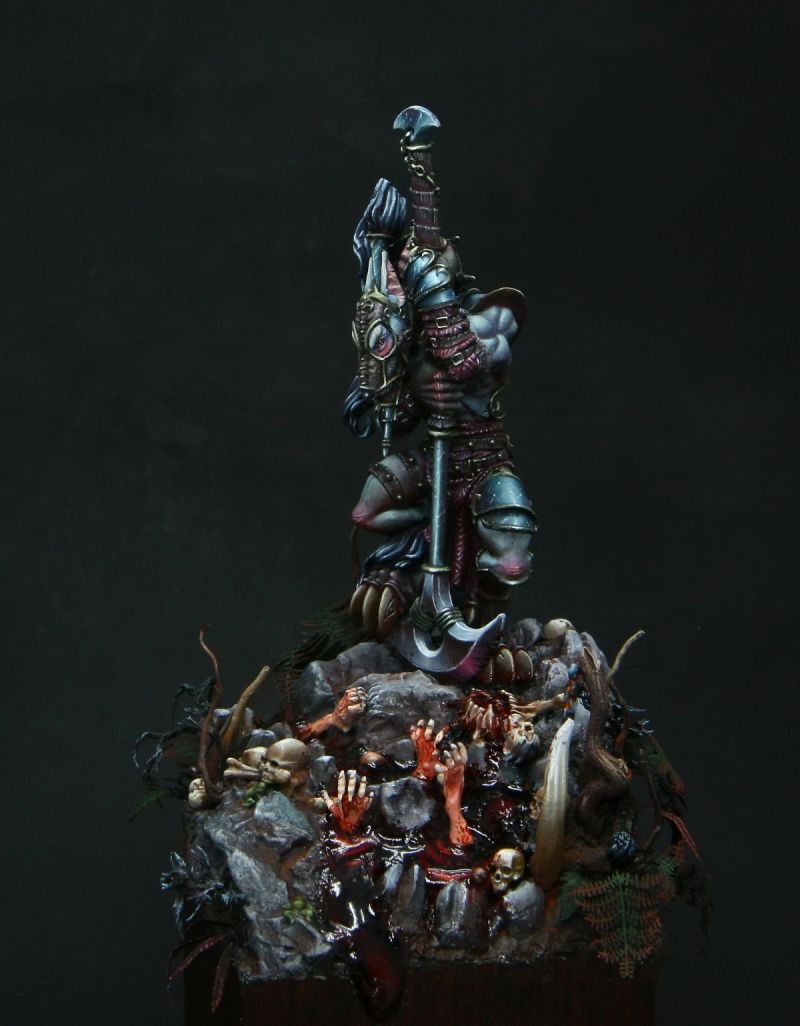
So let's get started. Todays Miniature is the confrontation miniature "Nemetis the Sacrilegious" painted by the very talented female russian painter Reka "Hope River" Nadezhda, Member of the Serpentarium .
Here's a link to more pictures on Putty and Paint, if you like vote: http://www.puttyandpaint.com/projects/3650
So what do I like about this miniature. Easy answer, EVERYTHING! But I can be more specific, going from the overall to the small details.
First I must say, I don't know a thing about the Confrontation fluff, so I can only talk about what I see in this scene. To me with him on the top and the blood pool with the uprising hands it looks like a ritual is going on, or just some blood magic. The dark and on the miniature mainly cold colours are quiet fitting for this topic. Also the contrast between the cold coloured miniature and the red blood makes it very interesting. Also all the little details, the bones, skulls, horn and plants are properly placed into the scene. With the plants on the boarders of the scene painted quiet dark and the upwards going hands bright and the miniature itself also brighter the focus is centered in the middle in direction of the miniature.
Although the armour on the arm is a bit brighter then the face on the photos, still the face is bright enough to pull the focus on the face. On the complete miniature I like the contrasts and the lightsituations. The blendings are very smooth. On the skin you can see there is a global contrast, meaning the arms are quiet bright and when you go downwards the skin is getting darker, like on the legs. Okay the hands are darker then the arms but they've just got a different colour.
The wrinkles on the knees and knuckles are very well accented. The red (?) eyes make a nice connection colourwise and storywise with the blood pool and the reflection point in the eyes makes it look alive. Repeating the colours of the miniature on the base is always a good idea in my opinion.
The textures on the leather and the pattern on the fabrics are very nice details that don't spring into the eyes on the first look, they are eye candy for the closer look.
What I absolutely like are the metallics, painted in NMM. The colour gradient from dark to bright and the contrasts are very well controlled so on the photos it really looks like metall. The blue colour touch in the metall embeddes it perfectly into the whole colour scheme. All the small scratches and the light dots in the scratches make the metallics look marvelous.
In total this miniature is a very atmospheric and well painted miniature.
I think that's it, just a short blabla article that I hope you find kind of interesting to read.
So read you soonish!
Keine Kommentare:
Kommentar veröffentlichen